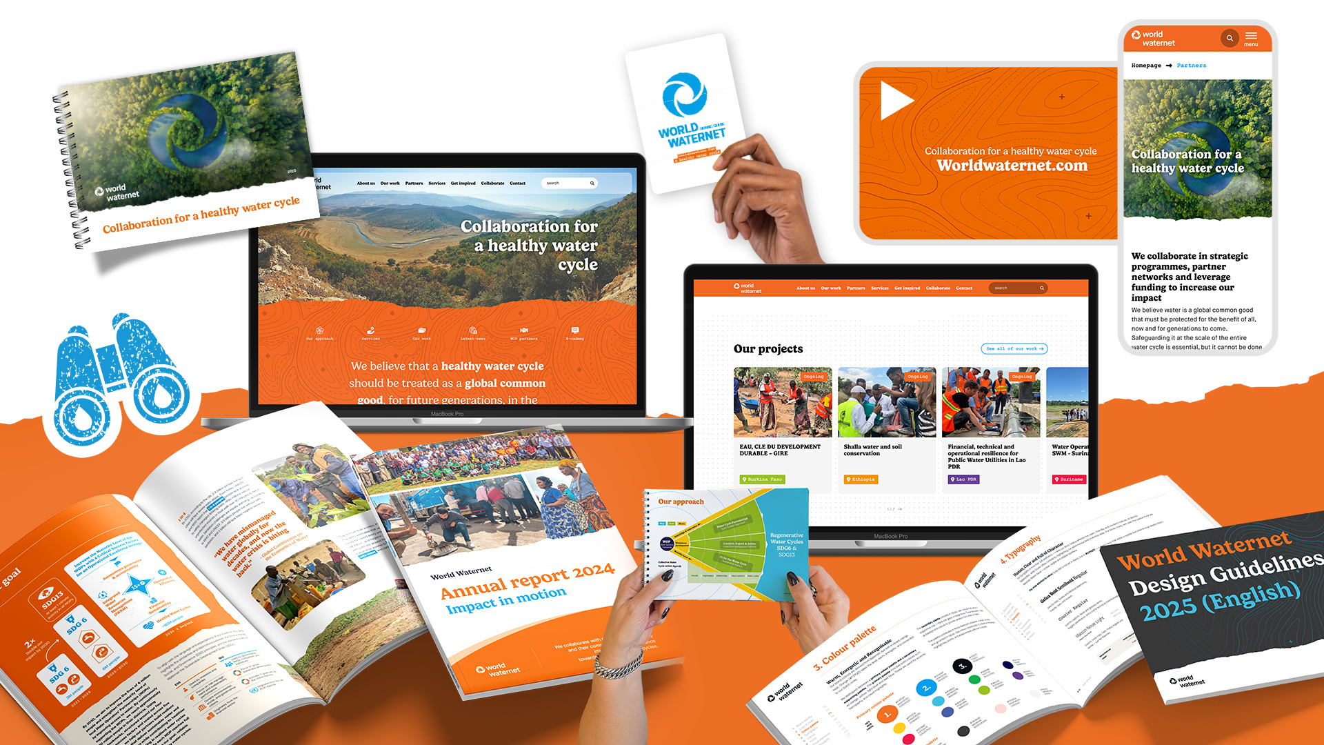
You may not have noticed it yet, but we’ve undergone a transformation. Not just on the surface, yes, our new style is bold and vibrant, but deep at our core. We’ve redefined who we are, why we do what we do, and how we show up in the world. And we’re ready to share it with you. New website. New film. Fresh visual identity. Same deep commitment to impact.
Hello orange
Our most visible change? Colour. You’ll now see warm orange tones pulsing through our visual identity, a nod to our Dutch roots, and a perfect complement to the signature blue of the Waternet family. Together, they reflect our dual spirit: grounded in expertise, but daring to stand out.
We've also chosen a new adventurous font (Gelicia) for our headers and adopted a bolder, more international tone of voice.
Introducing: the kind-hearted adventurer
Who are we, really? Over the past year and a half, we teamed up with New Growth Strategies, Embassy of the Earth, and JAAF to explore that very question. Through sessions with colleagues, partners and stakeholders, we looked critically at our identity:
- What makes us different?
- How do we stand out in a sea of water organisations?
- What is our promise to those we work with?
From this deep dive, a clear character emerged:
The kind-hearted adventurer captures our spirit!
- We seek the unknown.
- We challenge the status quo with imagination and courage.
- We energise others by doing things differently, and doing them together.
As Frodo van Oostveen, our CEO, explains:
"We’ve taken big steps to professionalise our communications and brand. Our new positioning helps us stand out internationally and connect more meaningfully with our partners and audiences."
A compass for everything we do
This isn’t just about aesthetics. It’s about alignment. About working from a shared compass, a brand passport and style guide that help us make consistent, confident choices. That clarity shows in everything from our partnerships to our presentations. Our new look is:
- Customer- and partner-focused – clear, approachable, and human
- Warm but direct – our tone of voice is active and kind
- Bold and future-oriented – everything we create has impact
- Innovative and flexible – designed for real-world collaboration
- Confident and distinctive – we’re not afraid to be different